The brutal have half the world
Brutalism in web designs, how to apply it?
Brutalism is a design style that is becoming increasingly popular on the web. A unique style, based on the brutalist architecture of the 50s and 60s (see photo Boston City Hall). But what exactly is brutalism in web design and how does it characterise itself? And how can you apply this in your website?

What is Brutalism?
Brutalism is a design style that emphasises the content and function of a website. It is characterised as rough, minimalist and clean. The style is inspired by the brutalist architecture of the 50s and 60s, which was characterised by the use of raw, raw materials such as concrete and steel. Also in the Netherlands you will find buildings in Brutalism style as collected in the recently published book Bruut.
How does Brutalism characterise itself in web design?
There are a number of design features that are common in cheeky designs, namely:
- Geometric shapes and sharp edges
- Outline Buttons
- underlined hyperlinks
- large bold/styled typography
- Colors that are web-safe
- monochromatism colour palettes (often black, white, or grey)
- Solid coloured backgrounds with little to no embellishment (i.e. no gradient)
- untreated photos (no edges, shadows, curves etc)
- Direct navigation (instead of dropdown or hamburger menus)
- Dividing lines between content sections
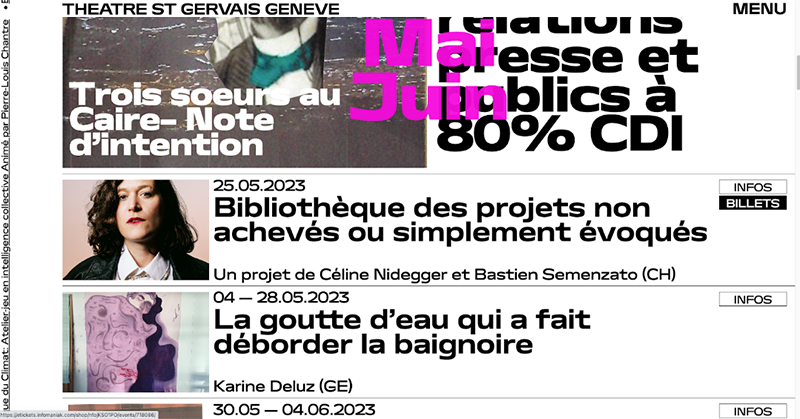
In the example of the Theatre St Gervais Geneva, you can clearly see the dividing lines between the different performances. A lot of emphasis has been placed on the texts, which are shown large and bold. You will also see backgrounds with monochromatic colour palettes (white, grey, black), outline buttons, and untreated photos.
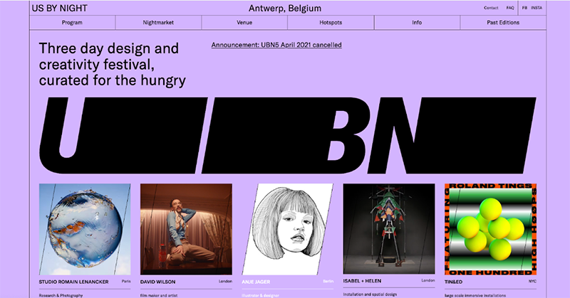
The Us By Night festival also applies some characteristics of brutalism, such as the dividing lines, underlined links, geometric/sharp shapes and large striking texts.
Pros and Cons of Brutalism
Advantages
- Increase effectiveness: The style is focused on minimalism and simplicity. It is therefore a good choice for websites where the emphasis should be on the content and not so much on a beautiful appearance. This allows you to create calm and usable websites, which will convert more users.
- Striking: It is a unique style, with which you can distinguish yourself from the competition.
- Fast loading times: Because bold designs often contain few images or embellishments, the loading time is reduced a lot. An advantage for UX and SEO.
Disadvantages
- Less timeless: Unlike other design styles, brutalism is less timeless.
- Reduced accessibility: Brutalism can also sometimes be too minimalistic, which actually reduces the findability of certain elements. Texts are also sometimes less easy to read. This reduces accessibility for visitors with disabilities or who use assistive devices.
- Possibly too rough or unprocessed: Not every visitor will appreciate the rough or processed appearance. Bold designs are often associated with a more alternative, underground look. As a result, it may be less suitable for professional or formal businesses or organisations.
Brutalism in practice
Brutalism is a unique design trend that often works well for more playful and artistic websites. However, if this is applied too extremely, it can actually have a negative impact on the functionality. That's why we recommend combining elements of this trend with other tried-and-tested design techniques to ensure user-friendliness. This ensures a good balance.
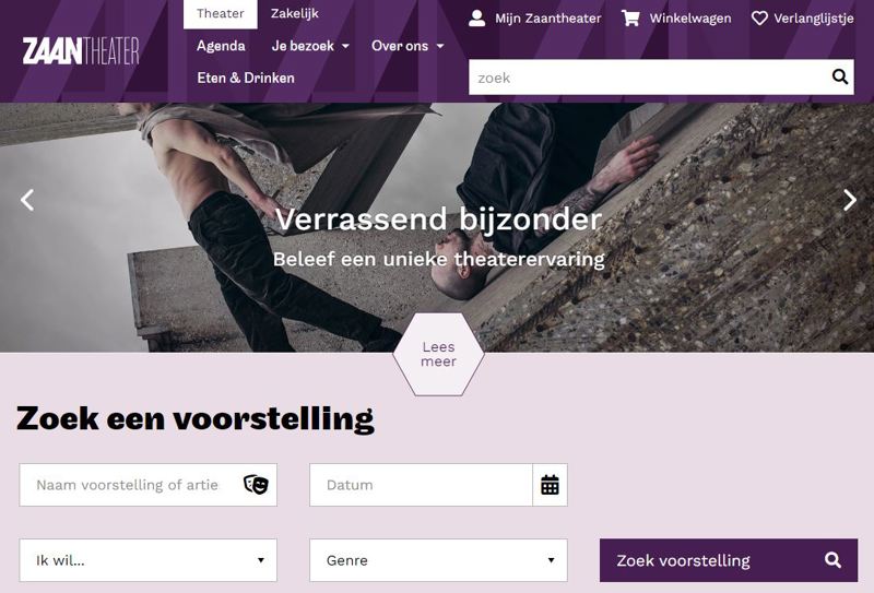
For example, during the recent restyling of the Zaantheater site, we used new, more powerful fonts, such as here at 'Find a performance'.
Sources
- Blog brutalist-website-design
- Qode Magazine - 60 Best Brutalist Websites
- Website brutalistwebsites.com
- Webflow Blog 10-Brutalist Websites
Photo: wikipedia.org
This tip is part of Basic Orange's series of practical online knowledge tips . Stay informed of all developments via our Facebook or LinkedIn channel.

Do you want to know how we can optimally apply this tip for your website?
I would like to tell you more about it.
Our tips are also highly appreciated by:


