Every website also has a dark side
Dark mode: a useful trend?
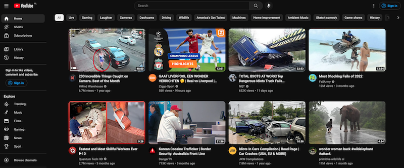
Dark mode is one of the top 5 web design trends for 2023 that we touched on in our previous knowledge tip. Websites like Google, Youtube and Reddit are already using it. But how valuable is it to expand your website's stylesheet with a dark mode and what does this involve in terms of design? Read our handy tips for dark mode websites.
What is dark mode anyway?
Dark mode is a design option where the background of a website or app is dark instead of white or light-coloured. This often results in a chic and modern look and feel. The switch to dark mode creates other design challenges, but also brings several advantages.

The benefits of dark mode websites
- Reduces eye fatigue and stress
Dark mode emits less bright light than a normal light-mode screen. This makes it easier for the eyes to adapt to the light conditions and reduces the strain on the eyes. The result is less eye fatigue and stress. - Improves readability of texts and photos
Texts and photos can stand out better on a dark mode website. This is particularly valuable for people with poor vision or those who are in a dark location. - Less likely to run out of battery
When you're viewing a normal website with a white background on your phone,
it consumes more energy because the pixels on the screen need more illumination than with a dark background. So you also save energy while using a dark mode website.
Tips for dark mode design
With dark mode design, there are different design challenges than with a normal light mode website. What can you pay attention to during the dark mode design process? Below are 5 tips to help you on your way.
Tip 1: Give users the option to switch between dark and light mode
There are websites that automatically switch to dark mode in the evenings. But you take away the control that users can have over their preferences. Instead, use a functionality that allows users to switch between light and dark mode themselves, see Engie.

Tip 2: Avoid pure black and white
Avoid pure black (#000000) for the background and pure white (#000000) for the text. Too high a contrast can cause eye pain while reading, so to speak. For the background, it's better to use a dark grey colour. It's best if this grey colour comes close to your brand's main colour. For the text, it is better to choose a dimmed version of white or light grey. Be careful! The contrast between backgrounds should also not be too low, otherwise the readability will be affected and the website will no longer be accessible. So check if your chosen colours meet the WCAG contrast guidelines. Youtube uses a dark grey colour (#0f0f0f) for the background. For texts, they use light grey colours (#F1F1F1 and #AAAAAA).
Tip 3: Be careful with saturated colours on dark backgrounds
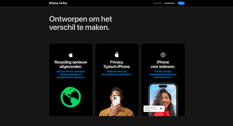
A saturated colour, such as bright blue, will quickly reduce legibility. Instead, go for a slightly less saturated shade of blue, like withApple, for example .


Tip 4: don't use shadows in dark mode
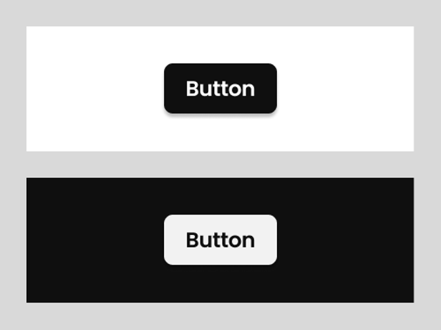
On a light mode website, shadows are often used to visualise interactions. For example, when you hover over a button with the mouse (hoverstate). This is often clearly visible on a light-mode website. On a dark mode website, this is not the case for most users. Do you see the shadow on the bottom button? Instead of shadows, it's better to use micro-interactions, such as the increase in the size of a button after hover. You can see this with Spotify, for example.
Tip 5: Communicate in depth
Even in dark mode, we need to help users by visualising the visual hierarchy of the website. You can do this in dark mode by using lighter shades of your background, colour, or greyscale to draw your users' attention to certain content. You can see this clearly withReddit's dark mode website, for example. The content is divided into light grey blocks. The search function is even slightly lighter than the colour of the menu to stand out even more.
Sources:
This tip is part of Basic Orange's series of practical online knowledge tips . Stay informed of all developments via our Facebook or LinkedIn channel.

Do you want to know how we can optimally apply this tip for your website?
I would like to tell you more about it.
Our tips are also highly appreciated by:


